fix(ui-badge,ui-scripts): use primaryTextColor for primary badge text#2646
Merged
Conversation


|
Visual regression report
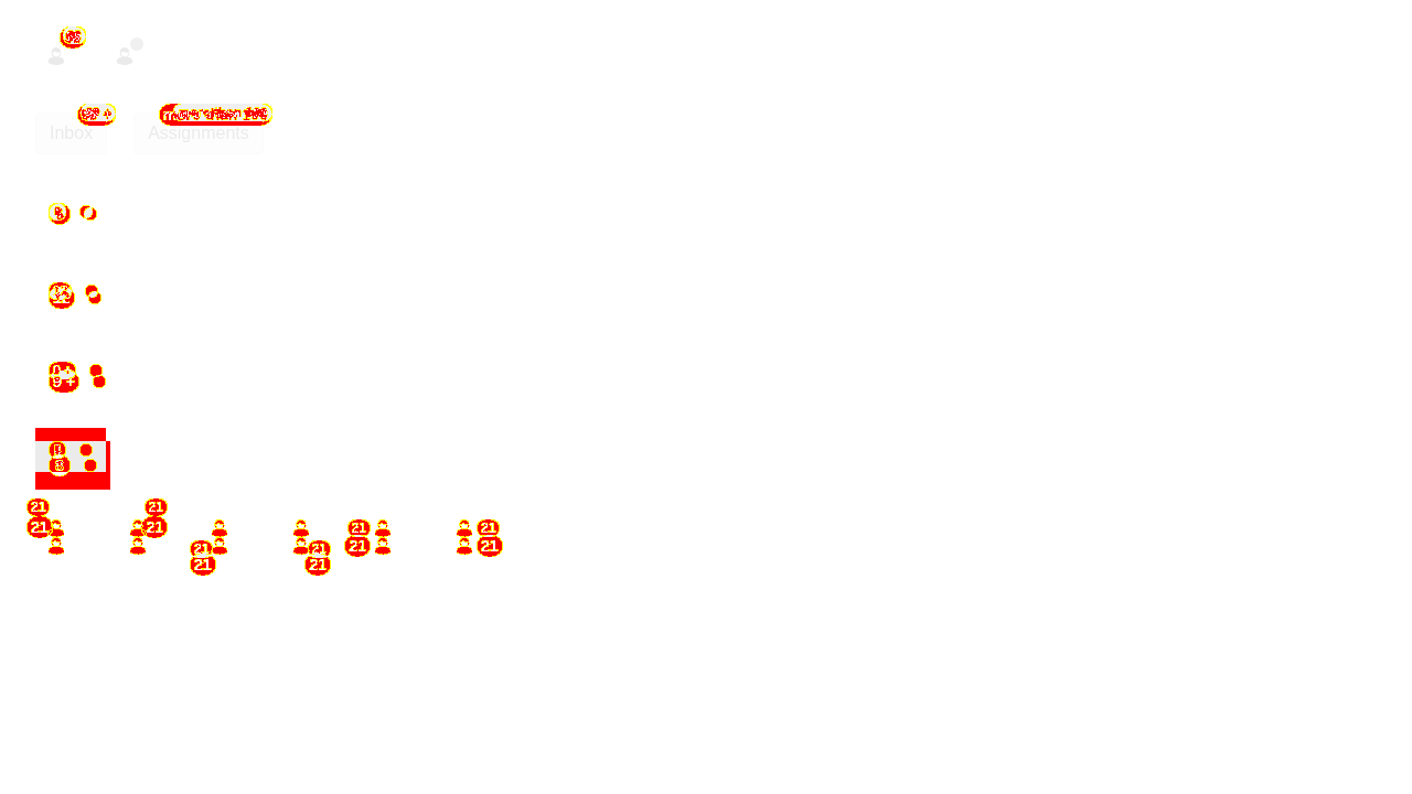
Diff images (1)badge.png — 8155 pixels differBaselines come from the |


joyenjoyer
approved these changes
Jul 20, 2026
 joyenjoyer
left a comment
joyenjoyer
left a comment
joyenjoyer
left a comment
Contributor
There was a problem hiding this comment.
looks good to me in every theme

adamlobler
approved these changes
Jul 20, 2026

balzss
approved these changes
Jul 21, 2026
 balzss
left a comment
balzss
left a comment
balzss
left a comment
Contributor
There was a problem hiding this comment.
looks good, sidenote: we should improve the visual comparison/diff because in the current form it's a bit hard to parse


Use componentTheme.primaryTextColor instead of componentTheme.color for the
primary badge text color, and tidy the generateStyle JSDoc.

Bump @instructure/instructure-design-tokens from v1.4.0 to v1.5.0.

instructure-design-tokens v1.5.0 release notes:
- Badge: reduced the fontSize token from textSm to textXs for a compact appearance.
- Badge: reduced the size token from 1.25rem to 1rem.
- Badge: added a new primaryTextColor token that references the inverse text color
  (consumed by this change).
- Badge: applied to canvas and rebrand themes.
- BaseButton: updated all ghost background tokens to use the "color" token type
  instead of "text" for consistency, and adjusted alpha values in new themes.
- BaseButton: institutional theming now works for secondary buttons.
- TruncateText: removed the lineHeight token.
- Sidenavbar: updated the globalNavLinkHover semantic color to use a navy shade
  instead of grey, fixing menu item hover color in light theme.

Fixes INSTUI-5115

🤖 Generated with [Claude Code](https://claude.com/claude-code)

Co-Authored-By: Claude <noreply@anthropic.com>
This file contains hidden or bidirectional Unicode text that may be interpreted or compiled differently than what appears below. To review, open the file in an editor that reveals hidden Unicode characters.
Learn more about bidirectional Unicode characters
Sign up for free
to join this conversation on GitHub.
Already have an account?
Sign in to comment
4 participants


Add this suggestion to a batch that can be applied as a single commit.This suggestion is invalid because no changes were made to the code.Suggestions cannot be applied while the pull request is closed.Suggestions cannot be applied while viewing a subset of changes.Only one suggestion per line can be applied in a batch.Add this suggestion to a batch that can be applied as a single commit.Applying suggestions on deleted lines is not supported.You must change the existing code in this line in order to create a valid suggestion.Outdated suggestions cannot be applied.This suggestion has been applied or marked resolved.Suggestions cannot be applied from pending reviews.Suggestions cannot be applied on multi-line comments.Suggestions cannot be applied while the pull request is queued to merge.Suggestion cannot be applied right now. Please check back later.
Summary
componentTheme.primaryTextColorinstead ofcomponentTheme.color(v2 styles).@instructure/instructure-design-tokensfrom v1.4.0 to v1.5.0, see https://github.com/instructure/instructure-design-tokens/releases/tag/v1.5.0Note: the design token bump also changes Badge size. This is OK for now because 11.7 is still a beta
Test Plan
Fixes INSTUI-5115
🤖 Generated with Claude Code